Placing of Openings
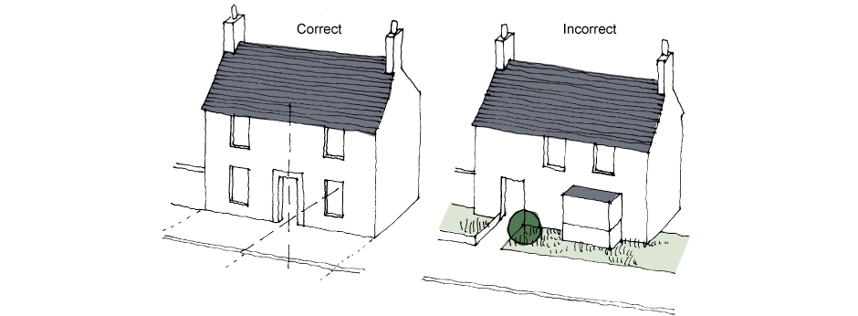
The best solution for the front elevation of an average medium-to-narrow frontage house is a symmetrical pattern of openings arranged around an opening placed on the central axis (preferably the front door). This arrangement provides a tightly ordered grouping of features and a strong visual presence – and is particularly crucial where the front elevation consists of a single gable.

Front-facing gables containing windows are a welcome and enlivening feature of many houses. Narrow-fronted houses often take the form of a front-facing gable end. However, there is a temptation to maximise the use of the extra volume this creates by splitting the gable into two rooms, each with a front-facing window. The resulting pair of windows creates an uncomfortable duality either side of the gable axis, which is not traditional.
The effect is worse if the windows are of unequal size and spacing. Traditional buildings in the region typically only have one room in the gable end, with a single, centrally placed window which both coincides with and reinforces the gable axis. This practice should be followed in new buildings wherever possible.
If a second room is unavoidable, the window of the larger room should be centrally placed on the gable axis and that of the smaller room relocated to the flank elevation. Alternatively, incorporate a wider, mullioned gable window and position the partition between the rooms so as to butt up against a mullion.
Departures from strict symmetry are possible so long as the central axis is strongly emphasised. Unfavourable solutions are those which are almost symmetrical and which, when applied to a number of adjacent houses, contribute to a visually poor streetscape.
A strongly centralised composition is not always required for houses with wider front elevations, due to the weakening of the central axis. In such instances, asymmetrical arrangements can look attractive – though the front door remains the most important element and should form the basis of the pattern.
When houses are linked in terraces, the street elevation includes more than one house, with each unit forming part of a larger composition. This makes greater freedom of composition possible.
While the front elevation is the most crucial, the same principles may apply to the rear and side elevations of houses – though a more relaxed approach may be viable if the elevation in question is not publicly visible.
It is common practice to use a window type appropriate to the room it serves. For example, a small, high-level window for a toilet, a raised sill for a kitchen or a patio door for a living room – irrespective of position or the patterns of openings thereby produced on the elevation. This can create unbalancing effects (such as a false perspective). Randomness of window size and positioning should be avoided, and a coherent pattern of openings created where possible.

This does not mean that 'composed randomness’ may not form part of a coherent pattern. Such an approach may be appropriate in some instances – for example, for a rear rather than a front elevation.
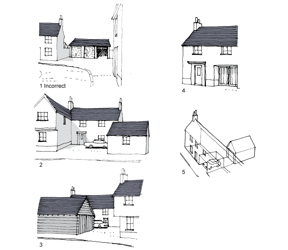
An integral garage can result in a large garage door that dominates the front of the house, compromising the importance of the front door and the relationship of the dwelling to the street. It also adds a distinctly utilitarian feature to the otherwise domestic character of the front elevation. If the house is narrow-fronted, the effect is even more dominant.
The prominent positioning of garage doors at the end of a cul-de-sac, road junction or bend in a road constitutes a visual downgrading of the townscape just at the point where a strong element (such as a ‘landmark’ house) is required. The solution is to be more flexible in the positioning of garages so that they can face in various directions or combine to form larger structures. These larger structures may then perform a more positive role in the wider townscape.

1. Incorrect. Prominent positioning of garages at bend in road
2. Correct. Sideways facing garage.
3. Correct. Double garages placed back to back to form barn-like structure
4. Correct. Timber garage door inset within opening. Front door dominates.
5. Correct. Garage in back garden, visitor space under carriage arch.
In the case of integral garages in terrace houses, the metal up-and-over door is a feature of poor visual quality, and is better located in the back garden, with a visitor parking space set within a carriage arch under the building. A well-designed timber door inset within an opening at least 200mm deep is another acceptable solution.
Page updated: 31/01/2018


